Lead generation strategies
How to Design Facebook Ads that Drive Student Recruitment
2021-02-01 · 4 min read
Ever stopped to wonder why prospective students aren’t engaging with your Facebook ads? You’re not alone.
With hundreds of other schools competing for their attention, it can feel like the odds are stacked against you.
Over the past 5 years, we’ve run our fair share of Facebook and Instagram campaigns for our clients in the education industry. And we’ve arrived at a winning formula. Image + text + call to action. Simple, right? But as always, the devil is in the details.
Let’s take a closer look at how to get your ads converting.
Scroll-stopping images
From funny cat videos to hilarious status updates - your prospect is drowning in an ocean of content.
So, every second counts. In fact, the average mobile user on Facebook spends just 1.7 seconds with a piece of content before scrolling on.
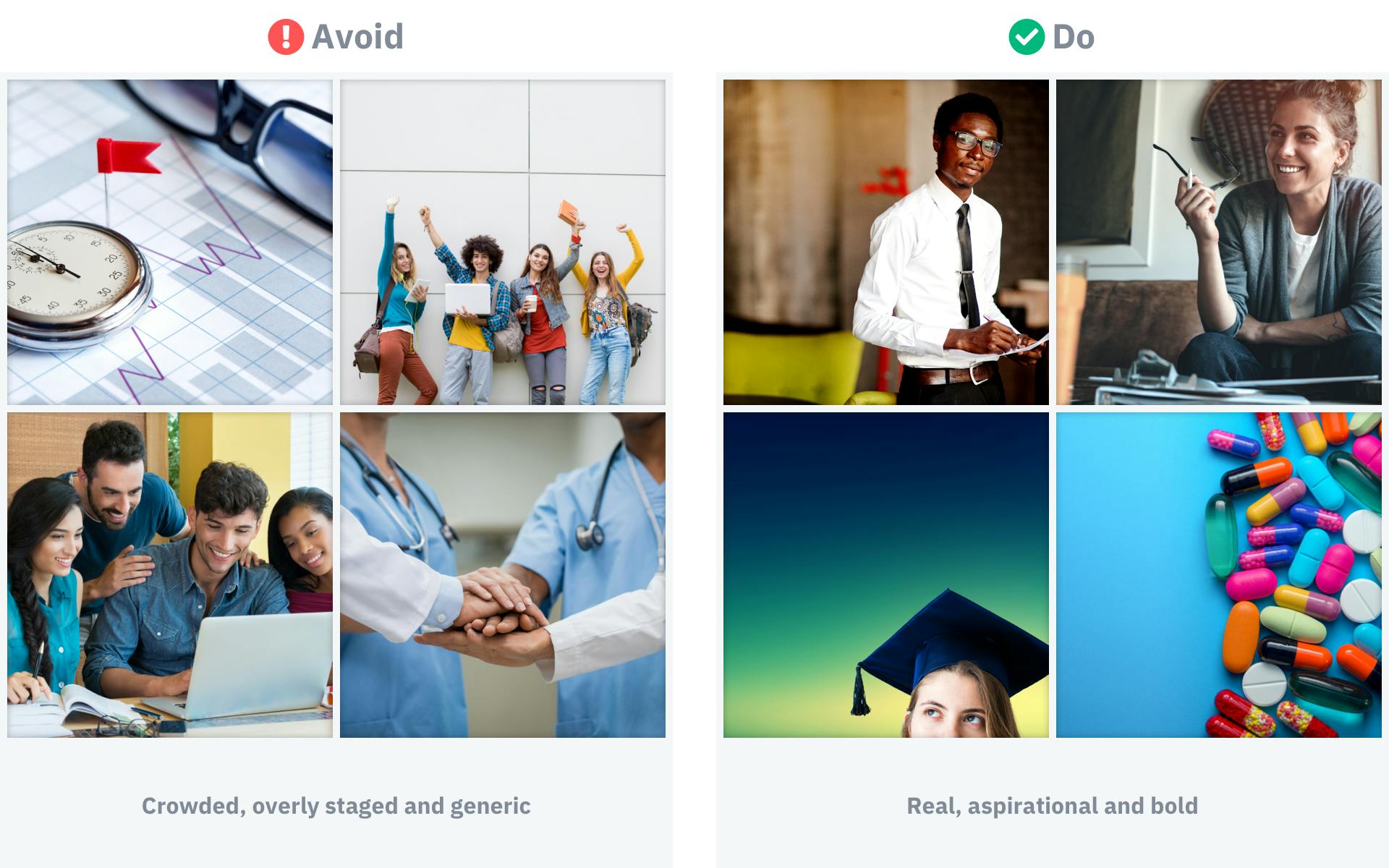
How then are you supposed to capture attention and stop the scroll? Catch their eye with an optimized visual. Users see the image first before reading any text.

Here are 3 pieces of advice when it comes to choosing relevant images for your next student recruitment campaign:
- Use eye-catching colours & contrast
- Be daring, avoid clichés & try the unexpected
- Experiment with aspirational imagery or destinations
Great, so you’ve found exactly the right image for your target audience. Now what?
The second most important element is the text in your ad image. The copy should be a bold promise to pique curiosity.
Even though Facebook has removed the strict 20% rule (images containing more than 20% of text were not allowed), try to keep your copy short and concise.
On its own, the ad creative must give enough context to communicate your message or offer clearly.
Let the copy focus on the problem you solve
Now, you’ve got their attention, and the clock is ticking. This is your big chance to nudge them towards the click. Finding it hard to find the perfect words?
Put yourself in your user’s shoes for a minute. Ask yourself, why should they invest their valuable time on your site or landing page? What are the benefits of interacting with the ad?
Present your user with a compelling value proposition and a real reason to click. Here are the elements of a value proposition that converts:
- Conveys a clear, easily understood message
- Understands the audience and make it about them
- Communicates a clear promise - “we can solve your problem”
Fearless and bold messaging on the visual complete? Excellent! You’ve just taken one giant step closer to driving another lead to your website.

Just one more thing. You’ll also need to think about supporting copy that can appear above or below your image. Here, you can provide additional context to your offer. Explain how quickly, easy or effective your product or service is.
For us, communicating the expected value is clear & straight-forward:
We help you figure out which programme is right for you! It only takes 4 minutes.
Prelaunch checklist
As a rule of thumb, we create a minimum of three different creatives for each campaign. And then let Facebook’s algorithm do the hard work to find the best performing ad. We then optimize further, tweak and improve.
So, ready to boost conversion with your next ad? Ask yourself these three simple questions first:
- Will the image capture attention?
- Is the value/benefit crystal clear?
- Does the ad speak to my intended audience?
Good luck with your next campaign! But if you want to take your lead generation strategy to the next level, don’t hesitate to reach out.
Ad DesignStudent MarketingRecruitment Innovation